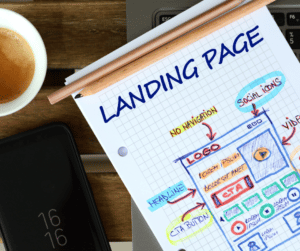
What is a landing page? A landing page is home to an active offer; its only purpose is to clearly explain the offer and encourage visitors to complete the process. Landing pages are often used when trying to drive traffic from an advertisement for something (such as a webinar, a product sale or a white paper download), to your website. Rather than sending people from your ad to your website’s homepage, it makes more sense to drive them to a hidden page on your site that specifically relates to the subject matter of your advertisement and encourages them to take the action you desire – otherwise known as a conversion.
Landing page conversions begin with understanding your target audience. If you haven’t spent time developing a buyer persona, then this is a perfect opportunity to begin. Remember, you’re writing specifically to solve a problem and to address buyers’ goals, motivations and pain points.
When developing strategies for turning a website landing page visit into a conversion, remember to keep choices to a minimum. We’re all familiar with the term ‘analysis paralysis.’ You don’t want to inhibit your visitor’s ability to make a decision by offering too many choices. This can occur if you haven’t provided a clear path, if the overall design of the page is confusing or if the call to action is ambiguous. If this happens, it’s likely visitors won’t convert. It’s essential that you focus on increasing your conversion rate to lower your cost per acquisition. There are a number of factors that work in unison to make your conversion successful. Keep reading for 10 helpful tips to develop a powerful landing page that will increase your conversion rates.
1. Develop A Conversion Rate Optimization Planner
The first step to having a substantial impact on your conversion rate is to develop a conversion rate optimization planner (CRO). Planners allow you to conduct a website audit, accomplish A/B testing and improve areas of your conversion funnel. When utilized properly, a CRO planner will walk you through the entire process from A to Z, allowing you to analyze and develop methods for increasing your conversion rate.
2. Pay Attention To Landing Page Styling
Providing users with appealing content will have one of the biggest impacts on your conversion rate. Experiment with colors, font, copy, layout and CTAs to see what triggers conversions. Take advantage of using visual hierarchy as a way to guide the visitor through your landing page.
3. Provide Social Proof On Website Landing Pages
There’s no question that your online presence and reputation are incredibly important to your conversion rate. Positive online reviews are considered one of the top three influences for consumers deciding to make a purchase. In fact, 89% of consumers check online reviews before doing so. Including social proof throughout your landing page, such as testimonials, is an excellent way to address any issues around quality, credibility and customer service. Don’t force your visitors to dig around for reviews. If it’s not obvious customers have enjoyed your product or service, your conversion rate might be weak.
4. Analyze How People Interact With Your Website
The importance of understanding how visitors navigate your website is often overlooked. If you discover that a majority of site visits end abruptly after reaching a contact form or landing page, it’s a clear indication that your website needs work. Are you offering your visitors too many choices, presenting complicated forms or providing unclear prompts for next steps? All of these can leave the visitor frustrated and cause them to lose confidence in your brand.
Analysis tools like Crazy Egg or HubSpot’s website grader can help you identify areas where your site is performing well and places it needs improvement. These tools give you access to screen recordings of users on your site where you can see where they clicked, if they bypassed an offer or if they stopped filling out a form midway through. In addition to calculating your conversion rate, many of these tools include heat maps of your site that allow you to easily view elements that stand out.
5. Utilize A/B Testing For Landing Pages
When running ads to get website visitors to follow a call to action, testing can go a long way to help determine what your customers positively respond to. Whether you’re attempting to get visitors to sign up for a webinar, fill out a form or download a white paper, you can use two nearly identical landing pages to run A/B tests and see which works best.
A true A/B test involves keeping all page content the same with the exception of just one element. For example, you may have identical copy and calls to action, but different images on the two versions of your landing pages. Alternatively, the images and copy could be the same, but the calls to action might be different – you get the idea.
6. Pay Attention To CTA Content And Placement
Even when you’ve followed your CRO plan to the letter, there can still be room for fine- tuning the process. When writing great copy, showing social proof and optimizing forms isn’t enough to drive conversions, it’s time to evaluate the call to action. Ask yourself these questions to reflect on this line of inquiry:
- Is your CTA clear?
- Is it compelling?
- Is it prominently placed on the page in more than one place?
You should also make sure to use an active voice with clever verbs to direct the user through the CTA. Here are some popular options that are to the point:
- Subscribe Today or Download Now!
- Learn More or Show Me More!
- Buy, Order or Shop Now!
Where you place the CTA button is important when you consider that 55% of visitors only skim content on a webpage and close the screen after the 15-second mark.
As such, if the page is short and simple, then a good rule of thumb is to place the button above the fold. Conversely, for longer content the CTA should be in two places: above and below the fold.
MECLABS conducted a test to measure the validity of a carefully placed CTA button using these two methods:
- A short page with poorly created content and the CTA button at the top.
- A long page with concise content, absent of any distracting elements with the CTA at the bottom.
They discovered that longer pages with simpler formats and concise messaging enjoyed a much higher conversion rate – up to 220%. It’s important to remember, however, that this could backfire if you plan on targeting mobile users since they typically want to avoid too much scrolling.
There are numerous styles of CTAs and the right one will largely depend on these two factors: your objectives and your target audience. Some examples of different styles of CTAs are as follows:
- Service Or New Product Discovery
The nature of this CTA is to provide more information to the reader. It could be a product or service that might require weighing options. Typically, the CTA will link to the product page the user is interested in.
- Lead Generation
Generally, this option can be found in the sidebar of a website or as a floating banner. It can also appear on blog articles at the end of a post. They must be to the point and eye-catching and will generally require an email address or phone number.
- More Info/Read More
Providing readers with the option to open another page to continue viewing content is a seamless way for a company to feature more content on the home page. This saves the user from having to scroll endlessly to find what they’re looking for, helping improve the bounce rate.
- Form Submission
This method is used to create a mailing list for a newsletter or to gather information.
- Social Sharing
This is a way to encourage your audience to share your content and increase engagement. It’s the simplest of all the CTAs and can effectively cause a post to go viral.
- After Sale
This style of CTA is highly personalized, giving users a reason to come back to your site. It could be in the form of a future discount, request for testimonial or a general survey. These CTAs are successful at getting new customers to turn into loyal, long-term clients.
- Promoting An Event
This method of CTA can be used far and wide to promote awareness about an upcoming event or conference. Whether it’s an in-person or online event, generating interest is key.
7. Provide Clear Instructions On Your Landing Page
The best landing pages are clean, uncluttered and concise. Consider removing any site navigation on your landing page so visitors aren’t tempted to click away or get distracted. Ideally, you want to remove any chance for your visitor to leave the page.
Ultimately, consumers are interested in convenience (solving a problem) and how the product or service makes them feel. Invest in writing a compelling landing page copy specific to your buyer persona.
Incorporating multimedia elements into your landing page can also make your site feel more trustworthy. A video testimonial can be very compelling, especially when it’s not too polished — authenticity is key. Product images and infographics can also assuage any doubts in potential consumers.
8. Landing Page Speed Can Affect Conversion Rates
Are you aware that 40% of people abandon sites that take more than three seconds to load? Page speed can present a huge challenge for businesses when it comes to mobile conversion. To improve page speed, video and image compression is essential. Google’s PageSpeed tools allow you to see how your site is doing. Having a responsive design that’s optimized for mobile devices will give you an edge over your competitors.
9. Remove Obstacles To Conversions
There are several tactics you can employ to instill trust in your brand and increase conversion rates.
- To start, make sure you don’t include spammy links, as these can be a huge deterrent for potential customers.
- Long periods between blog posts can create consumer distrust. For instance, if your brand hasn’t posted a blog article within the last year or two or if there are broken links within a blog post, it can affect consumer confidence.
- Consider offering a money-back guarantee. This is a great way to overcome any resistance a consumer may have about completing a call to action.
- Remember to keep your site current and include team bios so your audience knows who they’re doing business with.
10. Shorten Your Forms
As part of the conversion process, it’s your job to eliminate hesitation, not encourage it.
Generating long forms to fill out is the easiest way to kill a conversion. The best way to evaluate the forms you ask your reader to fill out is to examine each field to make certain it plays a critical role in fulfilling your objectives.
The first step should always be simple. For example, asking for an email address is a great entry point. You can always request additional information, but even if they opt out at that stage, you still have the user’s email address. Making the initial action an easy one will greatly improve your visitor’s chances of following through to the end.
Adding a third-party sign-up service is another way for businesses to gain conversions. This allows the user to sign up with their existing Google or Facebook account, removing the need to create a profile from scratch.
There’s no reason to complicate the conversion rate process for landing pages. It’s prudent to begin with a wide-angle view and put yourself in your customer’s shoes. Be honest with yourself and determine whether you would be inclined to make a purchase or sign up for something on your site after looking critically at your landing pages. If you wouldn’t, it’s a big sign that something needs to change.
Need Help Building Compelling Landing Pages Or Increasing Your Conversion Rates?
If you’re looking for help with creating landing pages that will convert, our team of experienced marketers is here to assist you! We offer a complimentary 30-minute, no-obligation consultation with our CEO, Erika Taylor Montgomery. Contact us today to learn more about how we can help you achieve your marketing and advertising goals.
Special Offer:
Sign up for a complimentary consultation during December and receive an Annual Marketing Planning Guide valued at $475! We offer a 30-minute phone consultation with our CEO, and can answer your questions and discuss your specific marketing needs - no strings attached. Call 408-218-2391 or contact us today to arrange your consultation!


