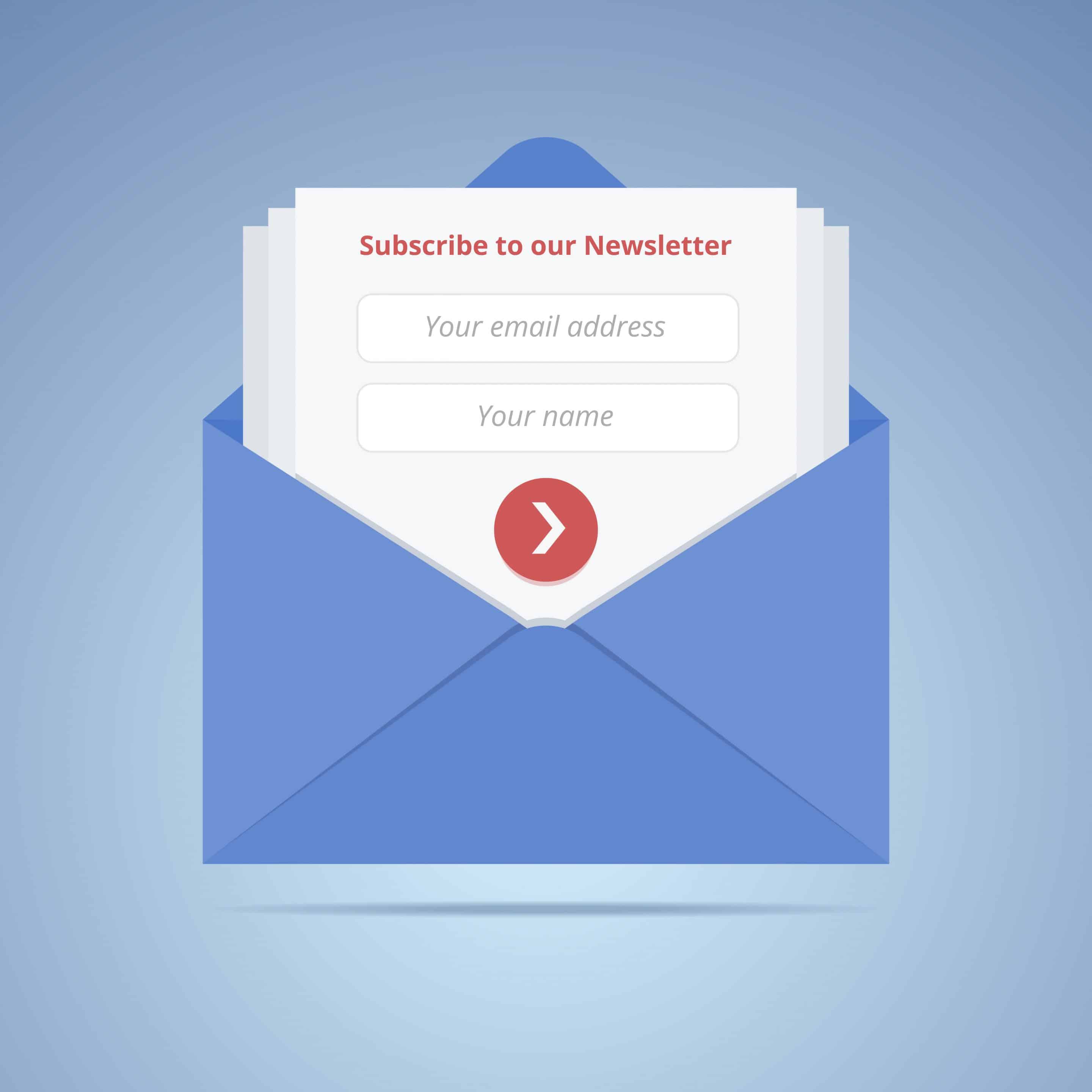
Have you ever heard the saying, “You catch more flies with sugar than vinegar?” Like many people in the U.S., I frequently heard this old adage while growing up. It is a universal truth that people enjoy pleasant communication (sugar) over negative attitudes (vinegar). Brands also need to follow this rule when developing their digital marketing strategy and creating their first point of direct communication with consumers on their websites: the email subscription pop up box.
Some businesses try to establish a funny and sassy digital marketing brand voice in their email subscription pop up boxes by using sarcastic opt in and opt out options, as described here. However, negative language within an email pop up box, just as anywhere else on your company’s website, can send a bad first impression to consumers.
Digital Marketing 101: What Is An Email Pop Up Box?
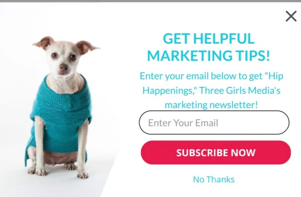
You have probably experienced the email subscription pop up as many brands use them as part of their digital marketing strategy. The email subscription pop up box encourages people to subscribe to a company’s email list, often by appearing on their screen after they are on the page anywhere from two seconds to two minutes. Here at Three Girls Media we have one featuring our adorable Office Greeter, Effy. It is one of the first forms of communication you get from our company when looking at our website.

You can see additional examples of email pop up boxes in this article by Just Uno. Usually, the pop up is prompted after a person has been visiting a business’ website for a few seconds, giving them the option to join the company’s email list, or decline. Email subscription pop up boxes are a great opportunity for a business to make and retain new connections with website visitors.
The Negative Digital Marketing Pop Up
Brands that want to establish a more personable digital marketing voice sometimes choose to have this reflected in their email subscription pop up boxes. For example, this article that features Investopedia shows that their options are “Enter Your Email” or “No thanks, I don’t care what the market does.” This copy is described as being more human sounding and witty.
However, as explained by Janet Aronica of Klaviyio, this language can come off as presumptuous and rude. In the case of Investopedia, it is not that people do not care about what the market does, it is that they are not ready to receive email communication from you. It is understandable that companies want to add a personal touch to their digital marketing and discourage you to click, “No thanks,” but there are ways to do so without coming across as condescending.
Digital Marketing Advice For Your Email Subscription Pop Up Box
When developing your digital marketing strategy, it’s important to remember that the tone of written words can be misinterpreted. While a sassy phrase may be intended as personable or funny, it can unintentionally come across as rude. If a sarcastic tone fits in with your brand, then don’t be afraid to use it in your overall website copy. Being edgy can sometimes help you stand out as Forbes suggests.
However, it is best to wait to introduce your more edgy brand voice after your consumer has time to enter the site and be exposed to your style. Keep your email subscription pop up box professional yet conversational. You can also add some more unique features through images and fun designs of the box itself.
If you need advice on your digital marketing, email subscription pop up boxes or your website content, Three Girls Media is happy to help. To schedule a complimentary consultation click here.
Special Offer:
Sign up for a complimentary consultation during December and receive an Annual Marketing Planning Guide valued at $475! We offer a 30-minute phone consultation with our CEO, and can answer your questions and discuss your specific marketing needs - no strings attached. Call 408-218-2391 or contact us today to arrange your consultation!

